Gapminder

gapminder dataset has data on life expectancy, population, and GDP per capita for 142 countries from 1952 to 2007. To get a glimpse of the dataframe, namely to see the variable names, variable types, etc., we use the glimpse function. We can also have a look at the first 20 rows of data.
glimpse(gapminder)## Rows: 1,704
## Columns: 6
## $ country <fct> "Afghanistan", "Afghanistan", "Afghanistan", "Afghanistan", ~
## $ continent <fct> Asia, Asia, Asia, Asia, Asia, Asia, Asia, Asia, Asia, Asia, ~
## $ year <int> 1952, 1957, 1962, 1967, 1972, 1977, 1982, 1987, 1992, 1997, ~
## $ lifeExp <dbl> 28.801, 30.332, 31.997, 34.020, 36.088, 38.438, 39.854, 40.8~
## $ pop <int> 8425333, 9240934, 10267083, 11537966, 13079460, 14880372, 12~
## $ gdpPercap <dbl> 779.4453, 820.8530, 853.1007, 836.1971, 739.9811, 786.1134, ~head(gapminder, 20) # look at the first 20 rows of the dataframe## # A tibble: 20 x 6
## country continent year lifeExp pop gdpPercap
## <fct> <fct> <int> <dbl> <int> <dbl>
## 1 Afghanistan Asia 1952 28.8 8425333 779.
## 2 Afghanistan Asia 1957 30.3 9240934 821.
## 3 Afghanistan Asia 1962 32.0 10267083 853.
## 4 Afghanistan Asia 1967 34.0 11537966 836.
## 5 Afghanistan Asia 1972 36.1 13079460 740.
## 6 Afghanistan Asia 1977 38.4 14880372 786.
## 7 Afghanistan Asia 1982 39.9 12881816 978.
## 8 Afghanistan Asia 1987 40.8 13867957 852.
## 9 Afghanistan Asia 1992 41.7 16317921 649.
## 10 Afghanistan Asia 1997 41.8 22227415 635.
## 11 Afghanistan Asia 2002 42.1 25268405 727.
## 12 Afghanistan Asia 2007 43.8 31889923 975.
## 13 Albania Europe 1952 55.2 1282697 1601.
## 14 Albania Europe 1957 59.3 1476505 1942.
## 15 Albania Europe 1962 64.8 1728137 2313.
## 16 Albania Europe 1967 66.2 1984060 2760.
## 17 Albania Europe 1972 67.7 2263554 3313.
## 18 Albania Europe 1977 68.9 2509048 3533.
## 19 Albania Europe 1982 70.4 2780097 3631.
## 20 Albania Europe 1987 72 3075321 3739.The country_data and continent_data will filter the country “India” and continent “Asia”.
country_data <- gapminder %>%
            filter(country == "India") # just choosing Greece, as this is where I come from
continent_data <- gapminder %>%
            filter(continent == "Asia")
First, we create a plot of life expectancy over time for India. We map year on the x-axis, and lifeExp on the y-axis. We use geom_point() to see the actual data points and geom_smooth(se = FALSE) to plot the underlying trendlines.
 plot1 <- ggplot(data = country_data , mapping = aes(x = year, y = lifeExp))+
   geom_point() +
   geom_smooth(se = FALSE)
Next we need to add a title to the same plot using the labs() function to add an informative title to the plot.
 plot1<- plot1 +
    labs(title = "Life Expectency of India over time ",
       x = "YEARS",
       y = "Life Expectency ")
plot1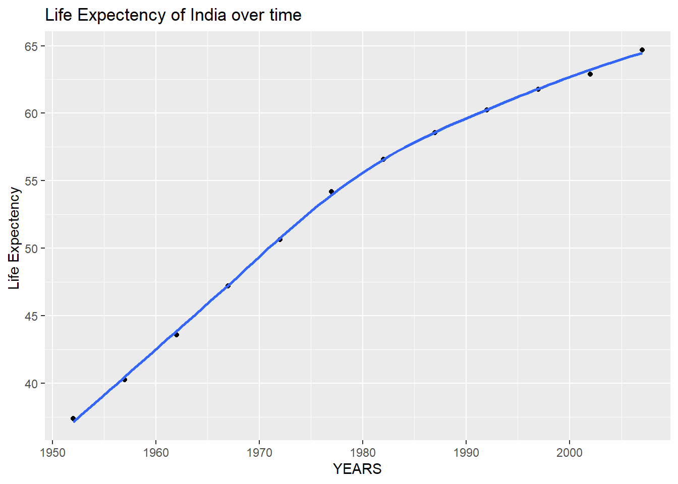
Secondly, we produce a plot for all countries in Asia. We map the country variable to the colour aesthetic. We also map country to the group aesthetic, so all points for each country are grouped together.
 ggplot(continent_data, aes(x = year , y =lifeExp  , colour= country, group = country))+
   geom_point() +
   geom_smooth(se = FALSE)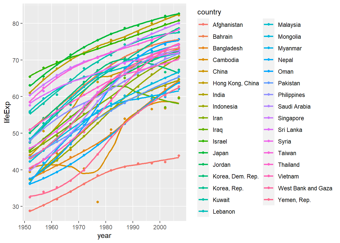
Finally, using the original gapminder data, we produce a life expectancy over time graph, grouped (or faceted) by continent. We will remove all legends, adding the theme(legend.position="none") in the end of our ggplot.
 ggplot(data = gapminder , mapping = aes(x = year , y =  lifeExp, colour= country ))+
   geom_point() +
   geom_smooth(se = FALSE) +
   facet_wrap(~continent) +
   theme(legend.position="none")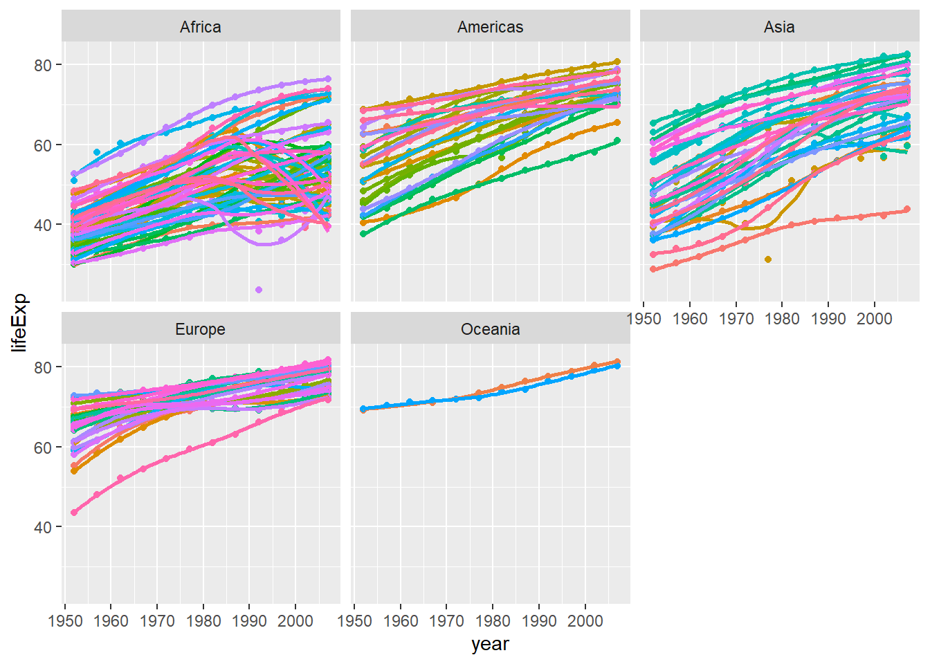
Observations for life expectency since 1952
The life expectency has been increasing linearly in most of the countires except a few countires in Africa and Asia. The constant improvement of life expectency can be attributed to access to better health care. Another factor could be the extensive research and development for prevention of diseases. The drop in the life expectency in Africa could be because of the outbreak of HIV-AIDs around mid 1970s. The same might be the cause of drop in a few countries in Asia. Let’s join a few dataframes with more data than the ‘gapminder’ package. Specifically, we will look at data on
- Life expectancy at birth (life_expectancy_years.csv)
- GDP per capita in constant 2010 US$ (https://data.worldbank.org/indicator/NY.GDP.PCAP.KD)
- Female fertility: The number of babies per woman (https://data.worldbank.org/indicator/SP.DYN.TFRT.IN)
- Primary school enrollment as % of children attending primary school (https://data.worldbank.org/indicator/SE.PRM.NENR)
- Mortality rate, for under 5, per 1000 live births (https://data.worldbank.org/indicator/SH.DYN.MORT)
- HIV prevalence (adults_with_hiv_percent_age_15_49.csv): The estimated number of people living with HIV per 100 population of age group 15-49.
We have to use the wbstats package to download data from the World Bank. The relevant World Bank indicators are SP.DYN.TFRT.IN, SE.PRM.NENR, NY.GDP.PCAP.KD, and SH.DYN.MORT
# load gapminder HIV data
hiv <- read_csv(here::here("data","adults_with_hiv_percent_age_15_49.csv"))
life_expectancy <- read_csv(here::here("data","life_expectancy_years.csv"))
# get World bank data using wbstats
indicators <- c("SP.DYN.TFRT.IN","SE.PRM.NENR", "SH.DYN.MORT", "NY.GDP.PCAP.KD")
library(wbstats)
worldbank_data <- wb_data(country="countries_only", #countries only- no aggregates like Latin America, Europe, etc.
                          indicator = indicators,
                          start_date = 1960,
                          end_date = 2016)
# get a dataframe of information regarding countries, indicators, sources, regions, indicator topics, lending types, income levels,  from the World Bank API
countries <-  wbstats::wb_cachelist$countries
We have to join the 3 dataframes (life_expectancy, worldbank_data, and HIV) into one. We may need to tidy your data first and then perform join operations.
- What is the relationship between HIV prevalence and life expectancy? We generate a scatterplot with a smoothing line to report our results.
skim(hiv)| Name | hiv |
| Number of rows | 154 |
| Number of columns | 34 |
| _______________________ | |
| Column type frequency: | |
| character | 1 |
| logical | 2 |
| numeric | 31 |
| ________________________ | |
| Group variables | None |
Variable type: character
| skim_variable | n_missing | complete_rate | min | max | empty | n_unique | whitespace |
|---|---|---|---|---|---|---|---|
| country | 0 | 1 | 3 | 24 | 0 | 154 | 0 |
Variable type: logical
| skim_variable | n_missing | complete_rate | mean | count |
|---|---|---|---|---|
| 1988 | 154 | 0 | NaN | : |
| 1989 | 154 | 0 | NaN | : |
Variable type: numeric
| skim_variable | n_missing | complete_rate | mean | sd | p0 | p25 | p50 | p75 | p100 | hist |
|---|---|---|---|---|---|---|---|---|---|---|
| 1979 | 107 | 0.31 | 0.03 | 0.04 | 0.01 | 0.01 | 0.02 | 0.04 | 0.16 | ▇▁▁▁▁ |
| 1980 | 151 | 0.02 | 0.01 | 0.00 | 0.01 | 0.01 | 0.01 | 0.01 | 0.02 | ▇▁▁▁▃ |
| 1981 | 149 | 0.03 | 0.01 | 0.00 | 0.01 | 0.01 | 0.01 | 0.01 | 0.02 | ▇▁▁▂▂ |
| 1982 | 146 | 0.05 | 0.01 | 0.00 | 0.01 | 0.01 | 0.01 | 0.01 | 0.02 | ▇▃▁▁▂ |
| 1983 | 146 | 0.05 | 0.01 | 0.00 | 0.01 | 0.01 | 0.01 | 0.02 | 0.02 | ▇▅▂▁▅ |
| 1984 | 151 | 0.02 | 0.01 | 0.00 | 0.01 | 0.01 | 0.01 | 0.01 | 0.01 | ▃▁▁▁▇ |
| 1985 | 144 | 0.06 | 0.01 | 0.01 | 0.01 | 0.01 | 0.01 | 0.01 | 0.05 | ▇▁▁▁▁ |
| 1986 | 152 | 0.01 | 0.01 | 0.00 | 0.01 | 0.01 | 0.01 | 0.01 | 0.01 | ▇▁▁▁▇ |
| 1987 | 151 | 0.02 | 0.01 | 0.00 | 0.01 | 0.01 | 0.01 | 0.01 | 0.01 | ▇▁▁▁▃ |
| 1990 | 8 | 0.95 | 0.80 | 1.91 | 0.06 | 0.06 | 0.10 | 0.40 | 12.70 | ▇▁▁▁▁ |
| 1991 | 8 | 0.95 | 0.96 | 2.22 | 0.06 | 0.06 | 0.10 | 0.50 | 13.60 | ▇▁▁▁▁ |
| 1992 | 8 | 0.95 | 1.13 | 2.55 | 0.06 | 0.06 | 0.10 | 0.67 | 17.20 | ▇▁▁▁▁ |
| 1993 | 8 | 0.95 | 1.32 | 2.92 | 0.06 | 0.06 | 0.10 | 0.88 | 20.60 | ▇▁▁▁▁ |
| 1994 | 8 | 0.95 | 1.51 | 3.30 | 0.06 | 0.06 | 0.10 | 1.25 | 23.30 | ▇▁▁▁▁ |
| 1995 | 8 | 0.95 | 1.68 | 3.68 | 0.06 | 0.06 | 0.20 | 1.48 | 25.10 | ▇▁▁▁▁ |
| 1996 | 8 | 0.95 | 1.82 | 4.04 | 0.06 | 0.06 | 0.20 | 1.48 | 26.20 | ▇▁▁▁▁ |
| 1997 | 8 | 0.95 | 1.93 | 4.33 | 0.06 | 0.10 | 0.20 | 1.40 | 26.50 | ▇▁▁▁▁ |
| 1998 | 8 | 0.95 | 2.02 | 4.55 | 0.06 | 0.10 | 0.30 | 1.40 | 26.30 | ▇▁▁▁▁ |
| 1999 | 8 | 0.95 | 2.07 | 4.69 | 0.06 | 0.10 | 0.30 | 1.48 | 25.70 | ▇▁▁▁▁ |
| 2000 | 8 | 0.95 | 2.10 | 4.77 | 0.06 | 0.10 | 0.30 | 1.48 | 26.00 | ▇▁▁▁▁ |
| 2001 | 8 | 0.95 | 2.11 | 4.80 | 0.06 | 0.10 | 0.40 | 1.40 | 26.30 | ▇▁▁▁▁ |
| 2002 | 8 | 0.95 | 2.09 | 4.79 | 0.06 | 0.10 | 0.40 | 1.37 | 26.30 | ▇▁▁▁▁ |
| 2003 | 8 | 0.95 | 2.08 | 4.74 | 0.06 | 0.10 | 0.40 | 1.30 | 26.10 | ▇▁▁▁▁ |
| 2004 | 8 | 0.95 | 2.06 | 4.67 | 0.06 | 0.10 | 0.40 | 1.30 | 25.80 | ▇▁▁▁▁ |
| 2005 | 8 | 0.95 | 2.03 | 4.60 | 0.06 | 0.10 | 0.40 | 1.30 | 25.60 | ▇▁▁▁▁ |
| 2006 | 8 | 0.95 | 2.00 | 4.53 | 0.06 | 0.10 | 0.40 | 1.37 | 25.70 | ▇▁▁▁▁ |
| 2007 | 8 | 0.95 | 1.98 | 4.47 | 0.06 | 0.10 | 0.40 | 1.37 | 25.80 | ▇▁▁▁▁ |
| 2008 | 8 | 0.95 | 1.96 | 4.43 | 0.06 | 0.10 | 0.40 | 1.30 | 25.90 | ▇▁▁▁▁ |
| 2009 | 8 | 0.95 | 1.93 | 4.34 | 0.06 | 0.20 | 0.40 | 1.30 | 25.80 | ▇▁▁▁▁ |
| 2010 | 9 | 0.94 | 1.93 | 4.33 | 0.06 | 0.20 | 0.40 | 1.30 | 25.90 | ▇▁▁▁▁ |
| 2011 | 7 | 0.95 | 1.91 | 4.28 | 0.06 | 0.20 | 0.40 | 1.30 | 26.00 | ▇▁▁▁▁ |
life_expectency_long <- life_expectancy %>%
  pivot_longer(2:302, values_to = "life_expec" , names_to = "year")
hiv_long <- hiv %>%
  pivot_longer(2:34, values_to = "prop_hiv" , names_to = "year")
life_hiv <- right_join(hiv_long, life_expectency_long, by = c("year" = "year", "country" = "country"))
life_hiv$year = as.numeric(life_hiv$year)
life_hiv_bank_data <- left_join(life_hiv, worldbank_data, by = c("year" = "date", "country" = "country"))
life_hiv_bank_data <- life_hiv_bank_data %>%
  rename(fertilityRate = SP.DYN.TFRT.IN, gdp = NY.GDP.PCAP.KD, mortalityRate = SH.DYN.MORT, primarySchoolEnrolment = SE.PRM.NENR)
We used a mixture of both right and left joins because so long as the dataframes are in the correct order when passed through the function, it does not matter whether you do a right or left join. We did not use an inner join as that would have resulted in data loss - the HIV dataframe only has values from the year 1979 onwards whereas the life expectancy dataframe has values from the year 1800 onwards.
life_hiv_bank_data_region <- right_join( life_hiv_bank_data ,countries, by = c( "country" = "country")) %>%
select(year, country, region,fertilityRate, gdp, mortalityRate, primarySchoolEnrolment, prop_hiv,life_expec )- What is the relationship between HIV prevalence and life expectancy? We generate a scatterplot with a smoothing line to report your results. You may find faceting useful
ggplot(life_hiv_bank_data_region, aes(x=prop_hiv, y=life_expec )) +
  geom_point() +
  scale_y_log10() +
  scale_x_log10() +
  ylim(30,100) +
  geom_smooth(method = "lm", formula= y~x) +
  labs( title = "Relationship HIV prevalence and life expectancy ", y = "Life Expectency", x = "Proportion of HIV prevalance ")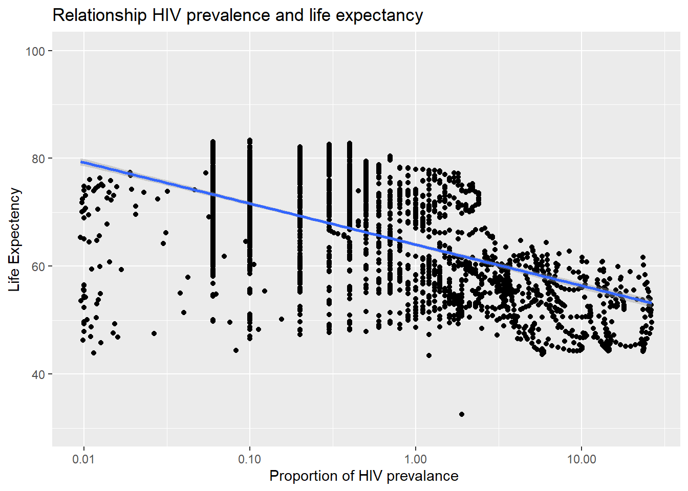
As we can see from the above plot, as the proportion of HIV prevalence increases, the life expectancy decreases. Thus, there is a negative relationship between the two variables.
- What is the relationship between fertility rate and GDP per capita? We generate a scatterplot with a smoothing line to report our results.
ggplot(life_hiv_bank_data_region, aes(x=fertilityRate , y=gdp )) +
  geom_point() +
  scale_y_log10() +
  scale_x_log10() +
#  ylim(30,100) +
  geom_smooth(method = "lm", formula= y~x) +
  facet_wrap(~region) +
  labs( title = "Relationship fertility rate and GDP per capita ", y = "GDP per capita", x = "Fertility rate ")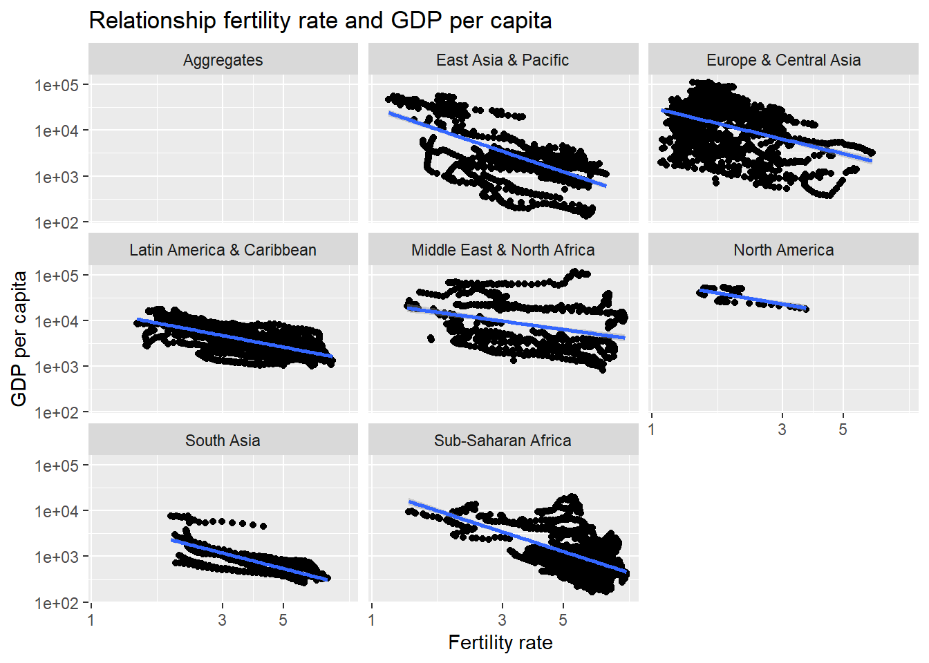
As GDP increases, the fertility rate decreases.
- Which regions have the most observations with missing HIV data? We generate a bar chart (
geom_col()), in descending order.
NA_count <- life_hiv_bank_data_region %>%
  group_by(region) %>%
  filter(is.na(prop_hiv)) %>%
  summarise(countNA = n())
ggplot(NA_count,aes( y = fct_reorder(region, countNA), x = countNA)) +
geom_col()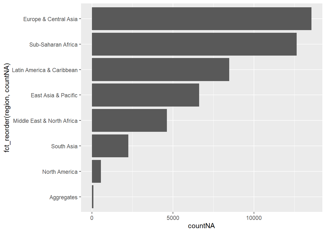
Sub-Saharan Africa and Europe & Central Asia have the most missing observations for HIV data.
- How has mortality rate for under 5 changed by region? In each region, we find the top 5 countries that have seen the greatest improvement, as well as those 5 countries where mortality rates have had the least improvement or even deterioration.
mortality_diff <- life_hiv_bank_data_region %>%
  filter(year == 1800 | year == 2021 ) %>%
  group_by(year) %>%
  mutate( region = region,
          country = country,
          life_expec = life_expec) %>%
  select(region, country, life_expec) %>%
  pivot_wider( names_from = year, values_from = life_expec) %>%
  rename("year_1800" = "1800", "year_2021"= "2021") %>%
  mutate(change_mortality = (year_2021 - year_1800) )
mortality_top5 <- mortality_diff %>%
group_by(region) %>%
slice_max(order_by = change_mortality, n=5)
mortality_top5## # A tibble: 32 x 5
## # Groups: region [7]
## region country year_1800 year_2021 change_mortality
## <chr> <chr> <dbl> <dbl> <dbl>
## 1 East Asia & Pacific Singapore 29.1 85.4 56.3
## 2 East Asia & Pacific Australia 34 83 49
## 3 East Asia & Pacific Thailand 30.4 79 48.6
## 4 East Asia & Pacific Japan 36.4 84.8 48.4
## 5 East Asia & Pacific New Zealand 34 82.2 48.2
## 6 Europe & Central Asia Italy 29.7 83.8 54.1
## 7 Europe & Central Asia Spain 29.5 83.6 54.1
## 8 Europe & Central Asia Sweden 32.2 83.1 50.9
## 9 Europe & Central Asia Kyrgyz Republic 23.9 73.3 49.4
## 10 Europe & Central Asia France 34 83.3 49.3
## # ... with 22 more rowsmortality_least5 <- mortality_diff %>%
group_by(region) %>%
slice_max(order_by = -change_mortality, n=5)
mortality_least5## # A tibble: 32 x 5
## # Groups: region [7]
## region country year_1800 year_2021 change_mortality
## <chr> <chr> <dbl> <dbl> <dbl>
## 1 East Asia & Pacific Papua New Guinea 31.5 59.3 27.8
## 2 East Asia & Pacific Cambodia 35 70.9 35.9
## 3 East Asia & Pacific Mongolia 31.8 69.7 37.9
## 4 East Asia & Pacific Kiribati 24.9 63.3 38.4
## 5 East Asia & Pacific Myanmar 30.8 69.5 38.7
## 6 Europe & Central Asia Ukraine 36.6 71 34.4
## 7 Europe & Central Asia Belarus 36.2 74.8 38.6
## 8 Europe & Central Asia Bulgaria 35.8 75.4 39.6
## 9 Europe & Central Asia Romania 35.7 75.7 40
## 10 Europe & Central Asia Moldova 33.1 73.3 40.2
## # ... with 22 more rowsWe can see that each region has seen various changes in mortality rate over the years.
- Is there a relationship between primary school enrollment and fertility rate?
ggplot(life_hiv_bank_data_region, aes(x=primarySchoolEnrolment, y=fertilityRate)) +
  geom_point() +
  scale_x_log10() +
  scale_y_log10() +
  geom_smooth(method = "lm", formula = y~x)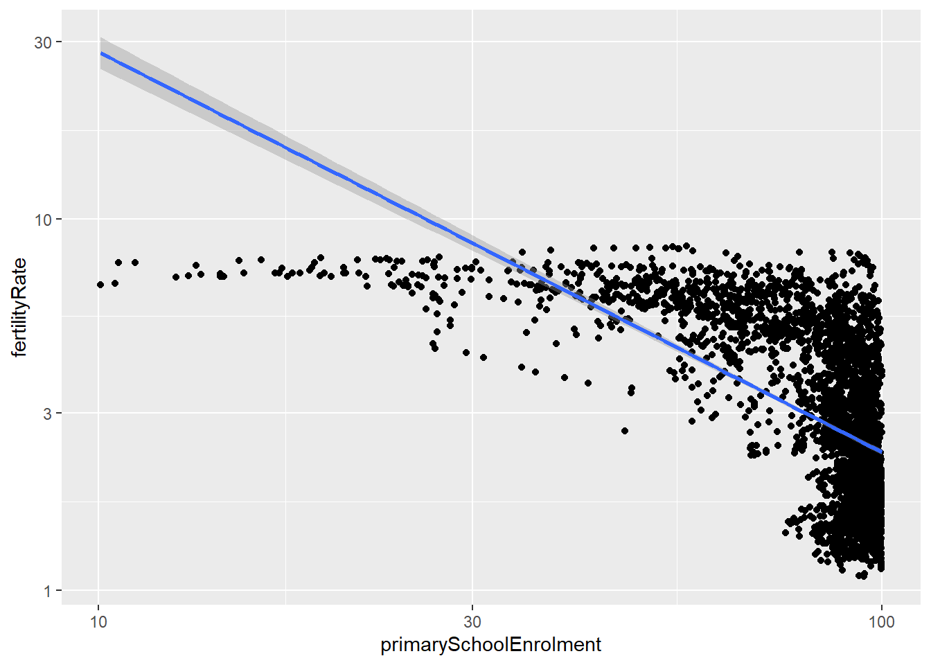
 life_hiv_bank_data_region %>%
  select(fertilityRate, primarySchoolEnrolment) %>%
  na.omit() %>%
  cor()
## fertilityRate primarySchoolEnrolment
## fertilityRate 1.0000000 -0.7265111
## primarySchoolEnrolment -0.7265111 1.0000000As we can see from the scatter plot, there is a strong negative relationship between primary school enrollment and fertility rate. We can see that as primary school enrollment increases, the fertility rate decreases. This is further supported by the correlation between the two variables. The correlation in question is -0.727 which is quite significant negative correlation.